
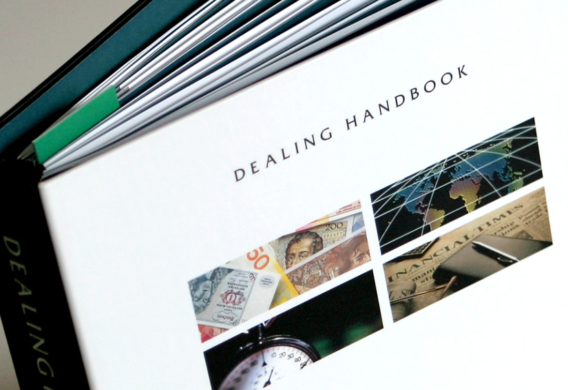
financial
CMC Markets
custom binder: dealing handbook

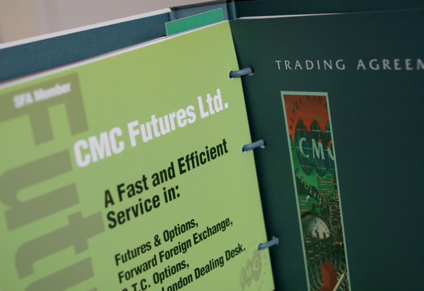
financial
CMC Markets
custom binder: dealing handbook
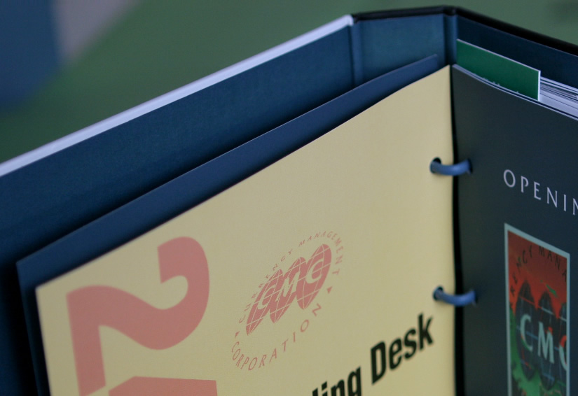
financial
CMC Markets
custom binder: dealing handbook
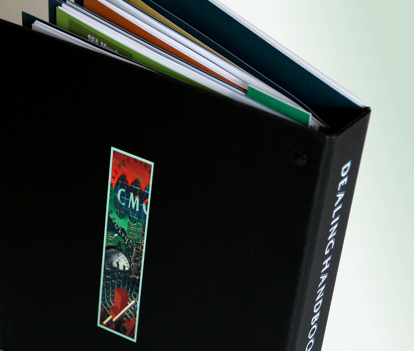
financial
CMC Markets
custom binder: dealing handbook
financial
CMC Markets
custom binder: dealing handbook
financial
CMC Markets
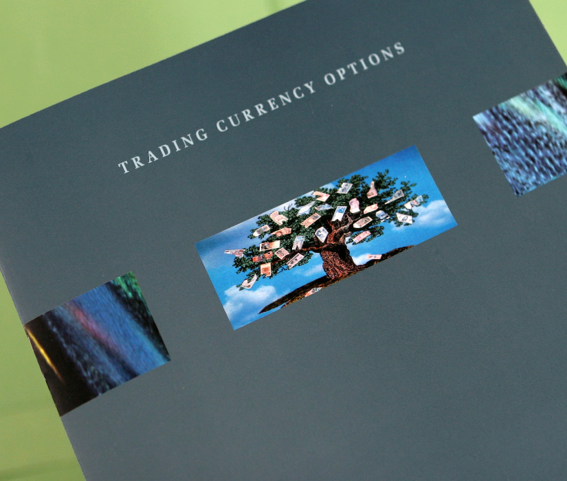
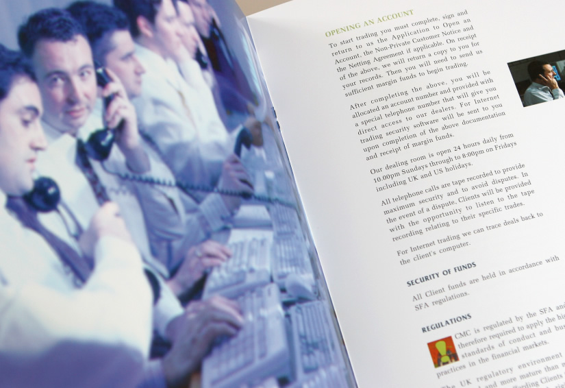
product brochure: currency options
financial
CMC Markets
product brochure: currency options
financial
CMC Markets
product brochure: currency options

financial
CMC Markets
photography: concept, model making,
studio direction
studio direction
financial
CMC Markets
product brochure: internet forex trading

financial
CMC Markets
product brochure: on-line CFD trading
financial
deal4free
corporate brochure: commission-free
trading online
trading online

financial
deal4free
corporate brochure: commission-free
trading online
trading online
financial
deal4free
corporate brochure: commission-free
trading on-line
trading on-line
financial
CMC Markets
PR collateral: CMC's dealing platform is
awarded Millennium Product status
awarded Millennium Product status
financial
Prudential Bache
product brochure: forex trading
financial
Prudential Bache
product brochure: forex trading

financial
Prudential Bache
product brochure: forex trading


food
Sultan's Cuisine
corporate branding, colour space,
logo design
logo design
food
Sultan's Cuisine
product brochure: middle eastern
cuisine
food
Sultan's Cuisine
product brochure: middle eastern
cuisine
cuisine
food
Sultan's Cuisine
product brochure: middle eastern
cuisine
>
cuisine
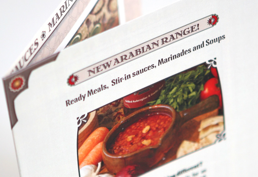
food
Sultan's Cuisine
flyer: arabian range
food
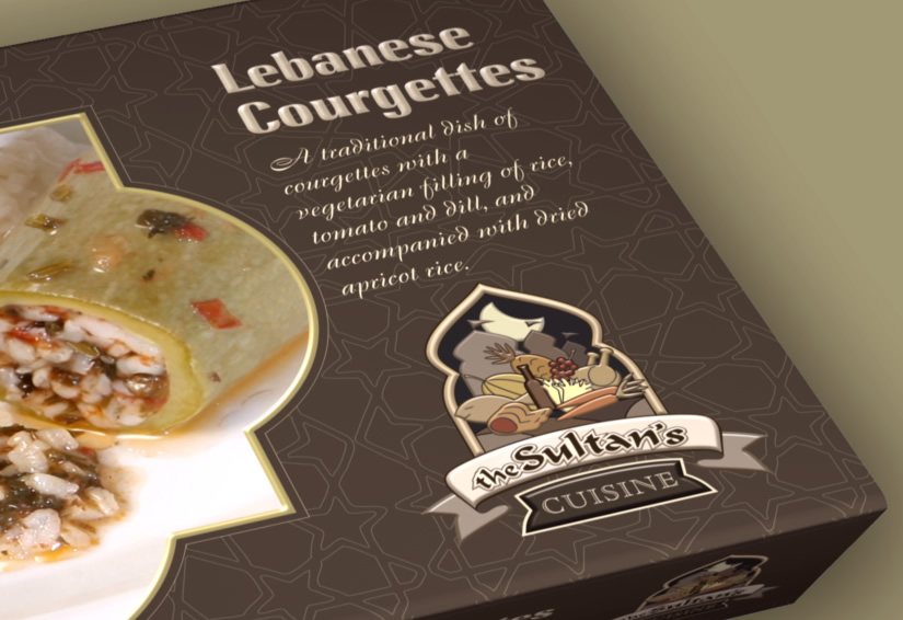
Sultan's Cuisine
product packaging: Lebanese courgettes
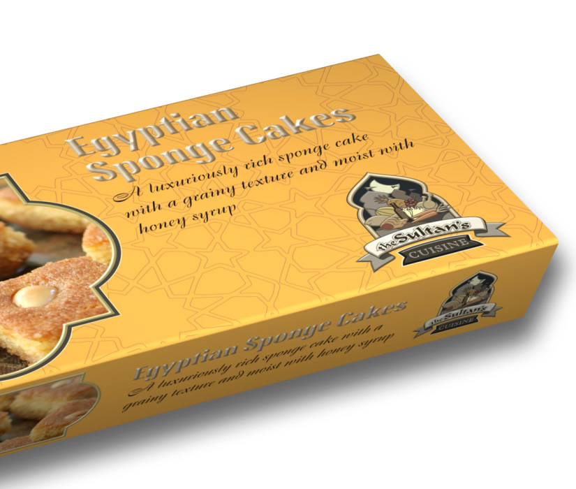
food
Sultan's Cuisine
product packaging: Lebanese sponge cakes
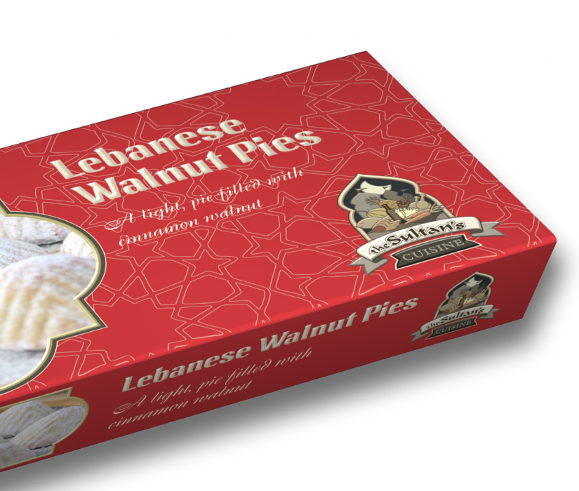
food
Sultan's Cuisine
product packaging: Lebanese walnut pies
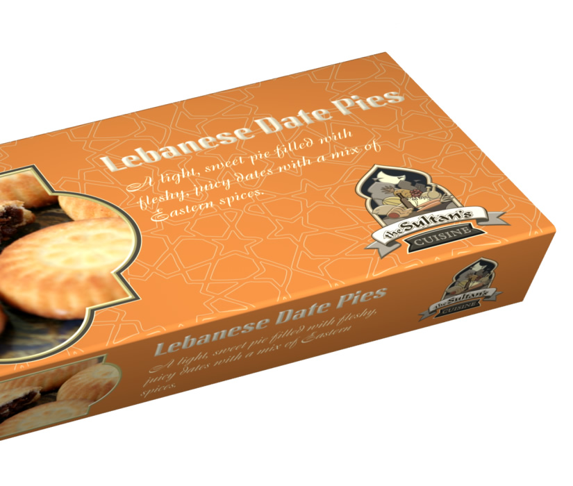
food
Sultan's Cuisine
product packaging: Lebanese date pies
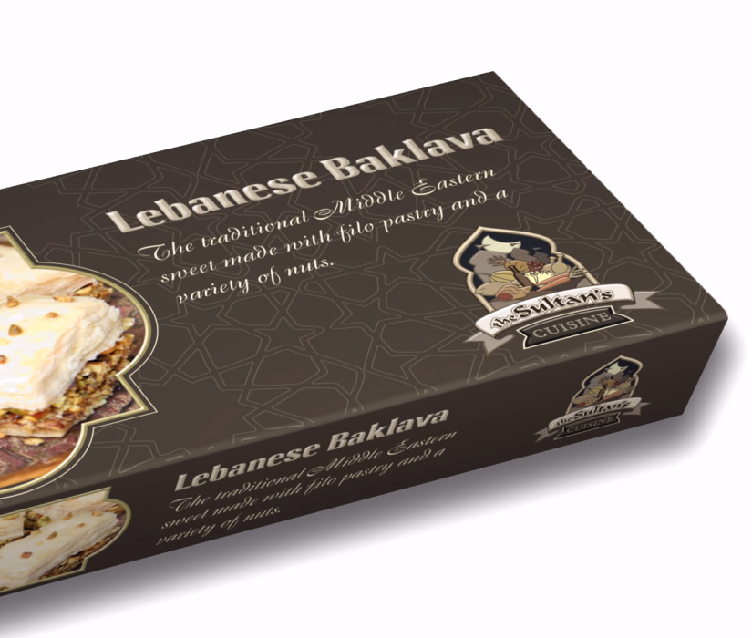
food
Sultan's Cuisine
product packaging: Lebanese
baklava
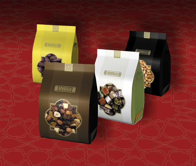
food
Arabella
product packaging: dates, nougat,
roasted nuts, healthy snacks

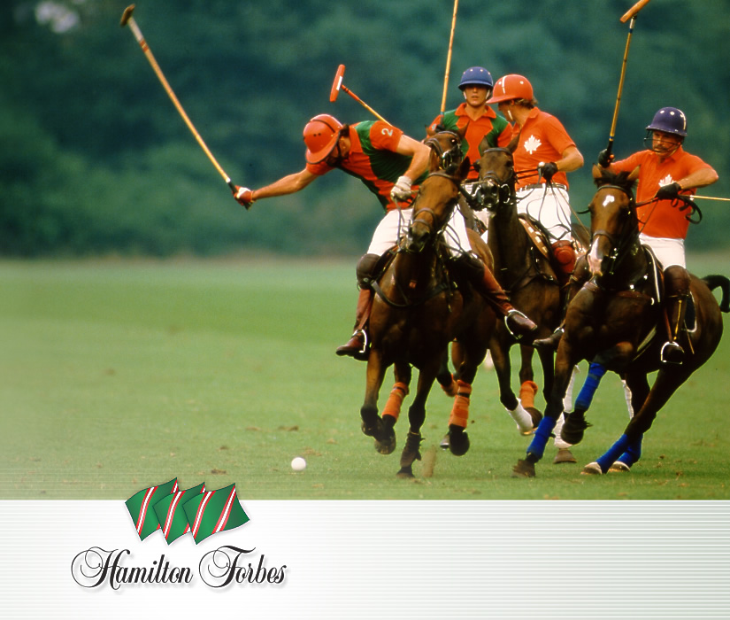
hospitality
Hamilton Forbes Hospitality
corporate branding
hospitality
Hamilton Forbes Hospitality
photo editing and direction
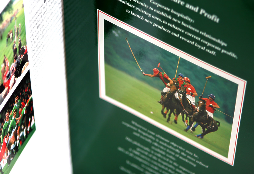
hospitality
Hamilton Forbes Hospitality
corporate folder

hospitality
Hamilton Forbes Hospitality
photo editing and direction
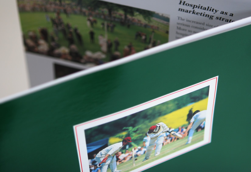
hospitality
Hamilton Forbes Hospitality
corporate folder

hospitality
Hamilton Forbes Hospitality
photo editing and direction
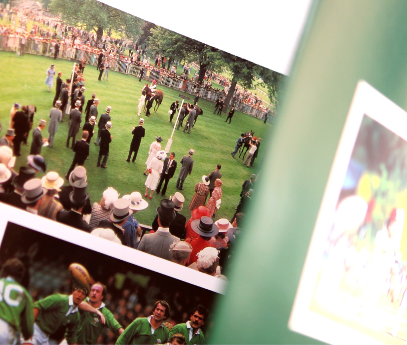
hospitality
Hamilton Forbes Hospitality
corporate folder

hospitality
Hamilton Forbes Hospitality
photo editing and direction

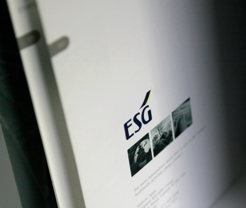
insurance
ESG
annual report
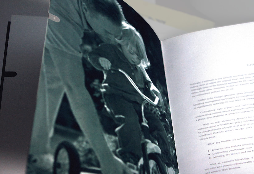
insurance
ESG
annual report
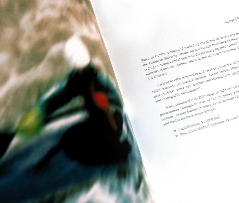
insurance
ESG
annual report
insurance
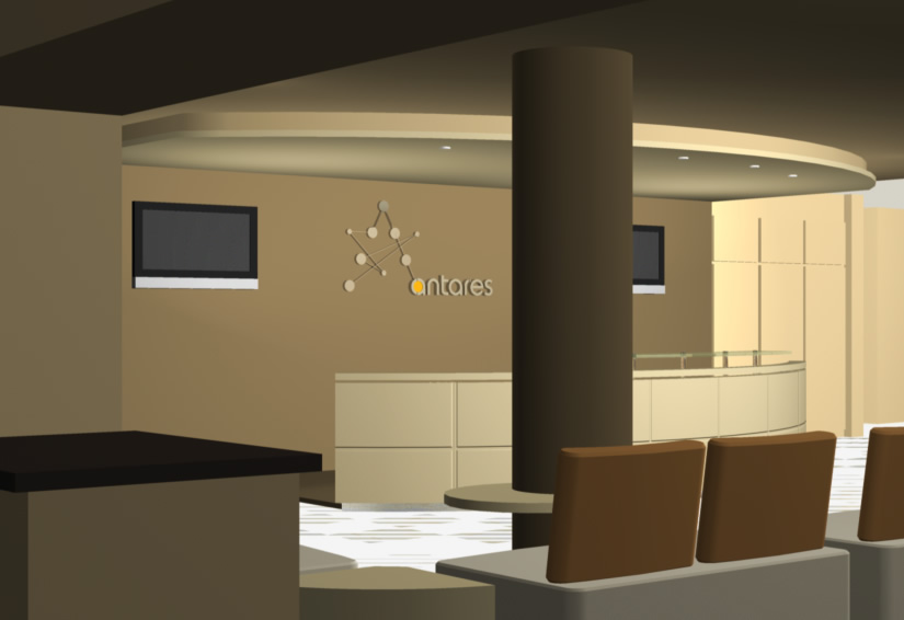
Antares Underwriting
corporate space branding:
reception, 37-39 Lime Street
reception, 37-39 Lime Street
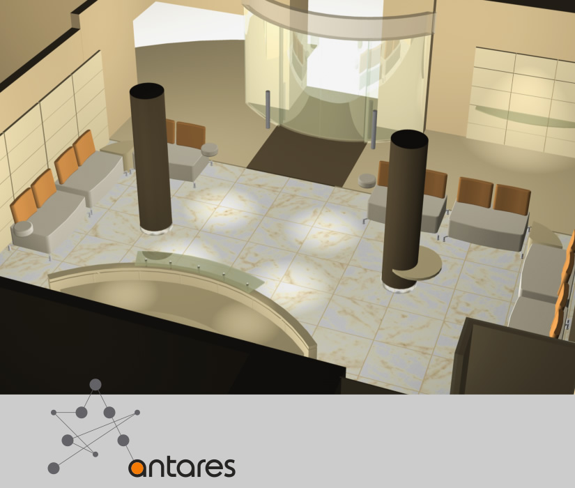
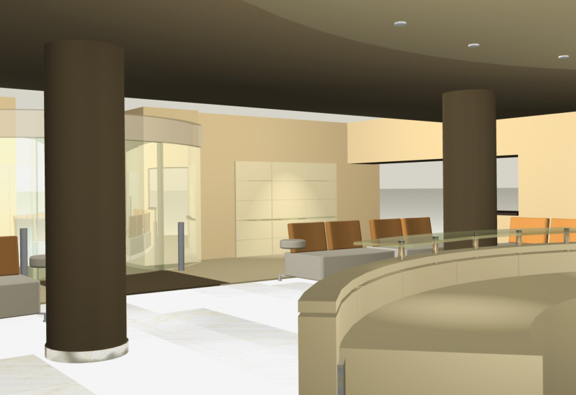
insurance
Antares Underwriting
corporate space branding:
reception, 37-39 Lime Street
reception, 37-39 Lime Street
insurance
Antares Underwriting
corporate sapce branding:
reception, 37-39 Lime Street
reception, 37-39 Lime Street
insurance
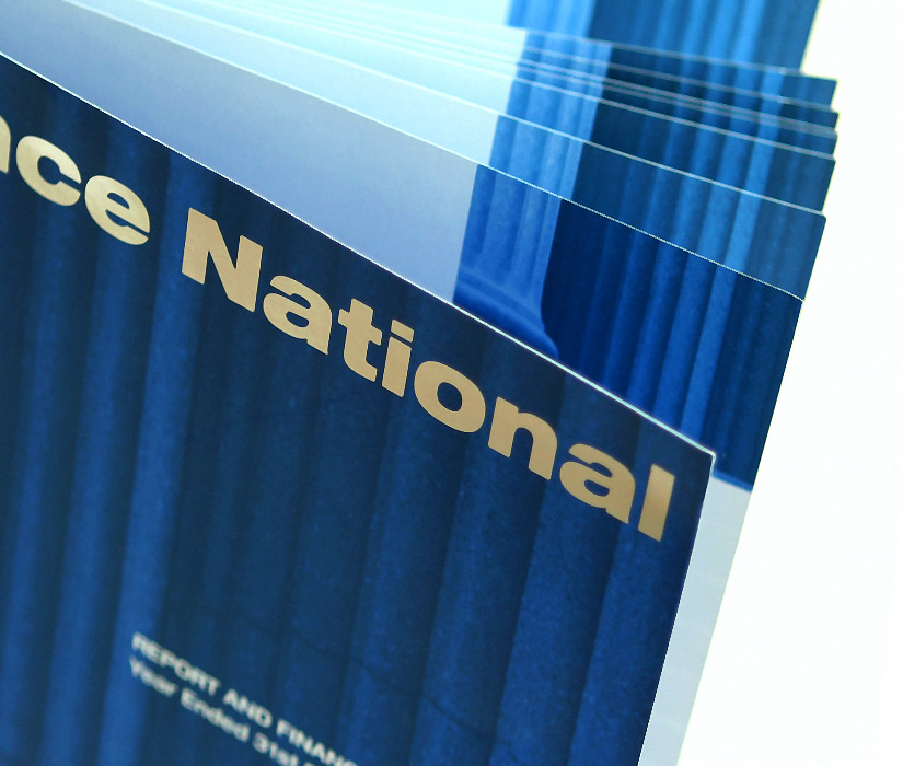
Reliance National
annual report
insurance
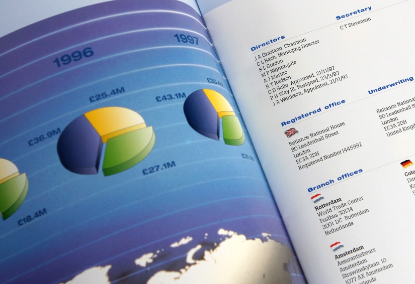
Reliance National
corporate folder and annual report
insurance
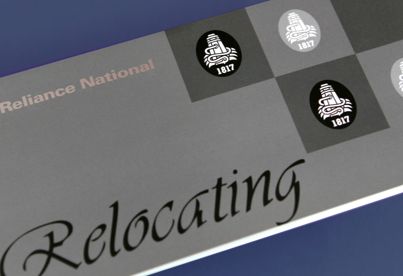
Reliance National
PR collateral, moving card with
foldout map
foldout map

insurance
Reliance National
corporate folder and annual report
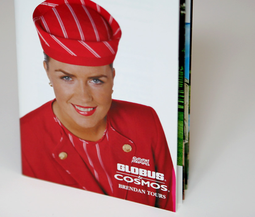
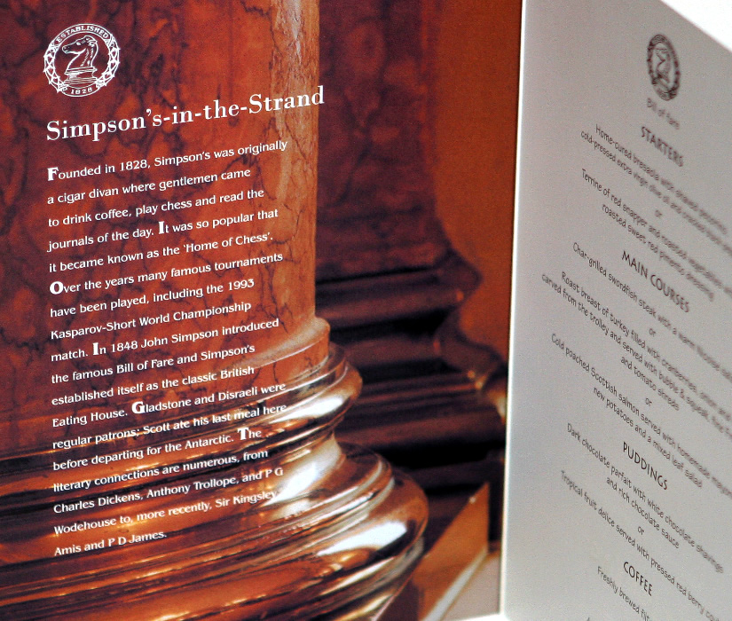
leisure
Globus, Cosmos, Monograms
product brochure, Welcome to London
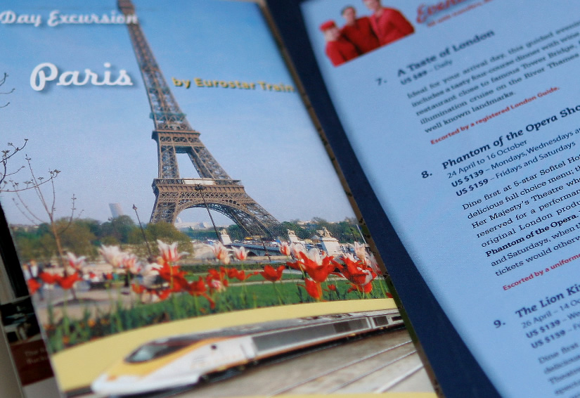
leisure
Globus, Cosmos, Monograms
product brochure, Welcome to London
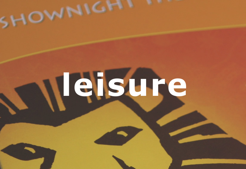
leisure
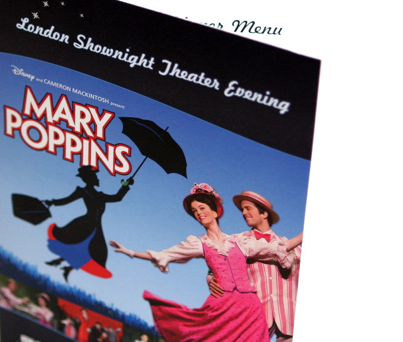
Globus, Cosmos, Monograms
souvenir menu: Shownight Theater Evening
leisure
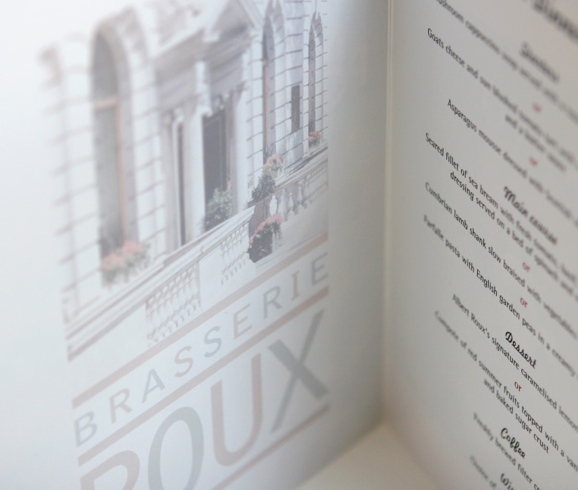
Globus, Cosmos, Monograms
souvenir menu: Shownight Theater Evening
leisure
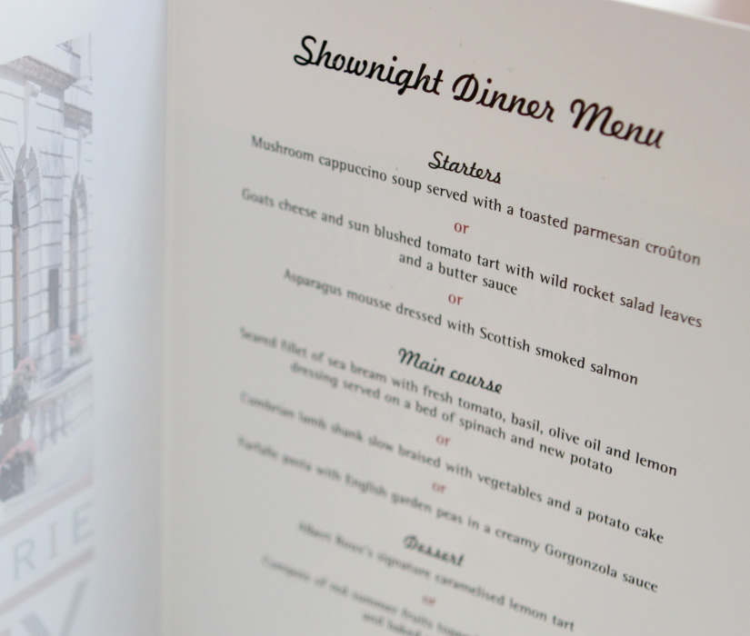
Globus, Cosmos, Monograms
souvenir menu: Shownight Theater Evening
leisure
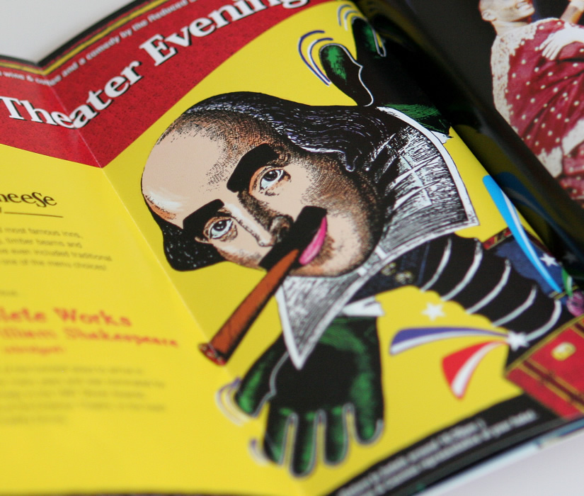
Globus, Cosmos, Monograms
souvenir menu: Shownight Theater Evening
leisure
Globus, Cosmos, Monograms
souvenir menu: Shownight Theater Evening

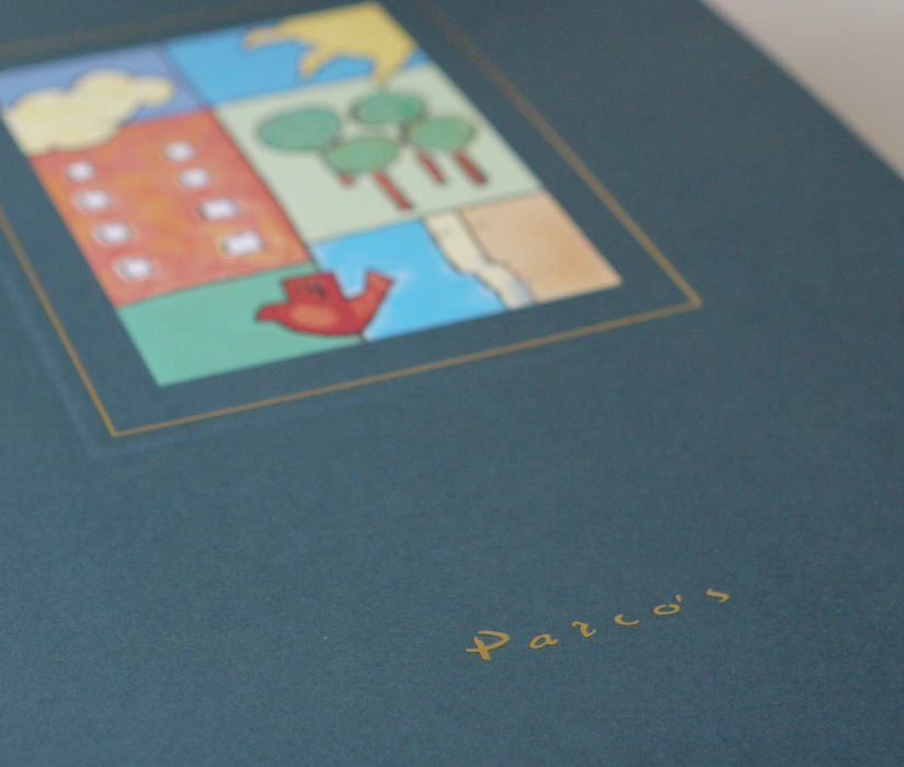
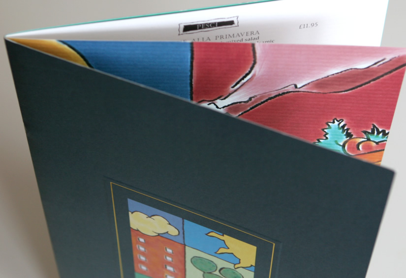
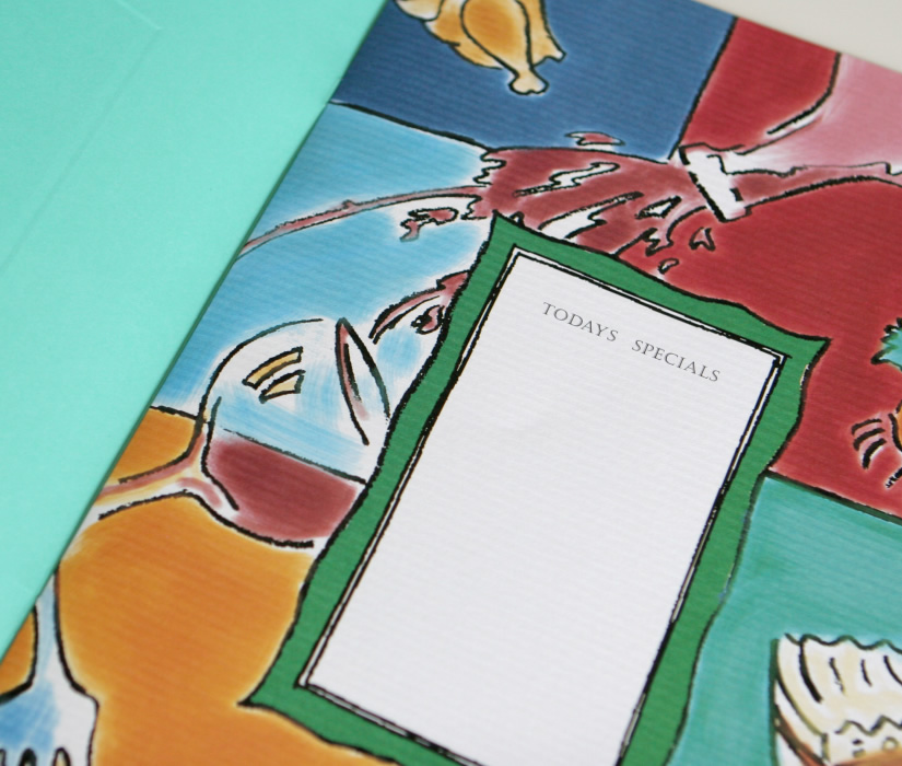
restaurants
Parco's Restaurant
menu design
restaurants
Parco's Restaurant
menu design
restaurants
Parco's Restaurant
menu design
restaurants
Parco's Restaurant
menu design
restaurants
Cafe St Pierre
interior design, logo refresh
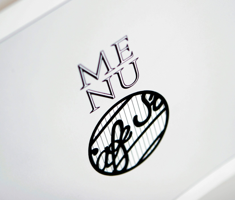
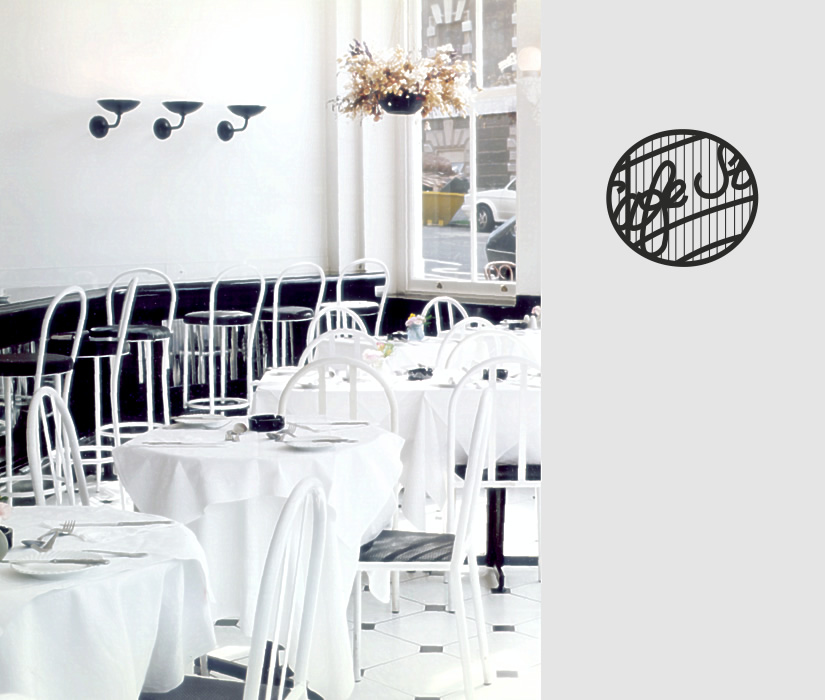
restaurants
Cafe St Pierre
menu design
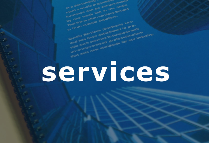
services
Design First
corporate folder
services
Design First
corporate folder

services
Design First
rate card
services
Quality Clean
brand collateral: presentation folder for tenders
services
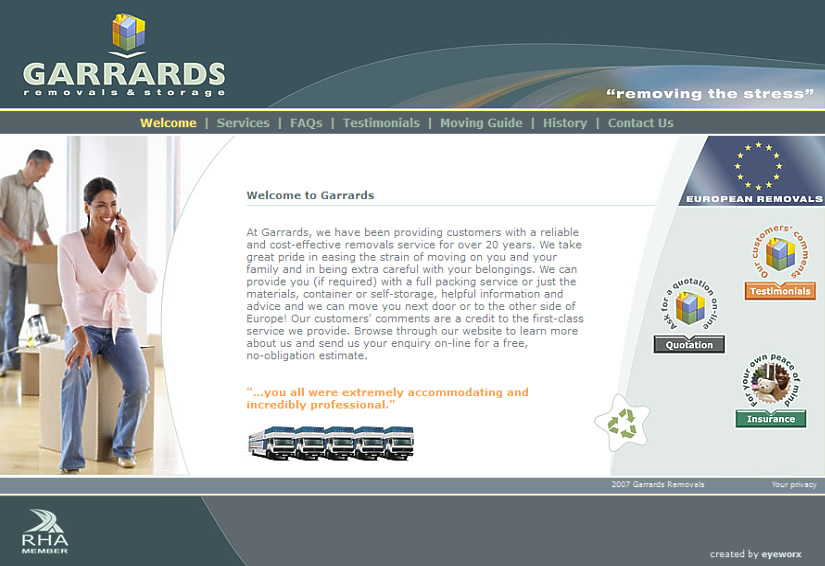
Garrards Removals & Storage
identity and logo design

services
Garrards Removals & Storage
identity: photo editing
services
Garrards Removals & Storage
website design

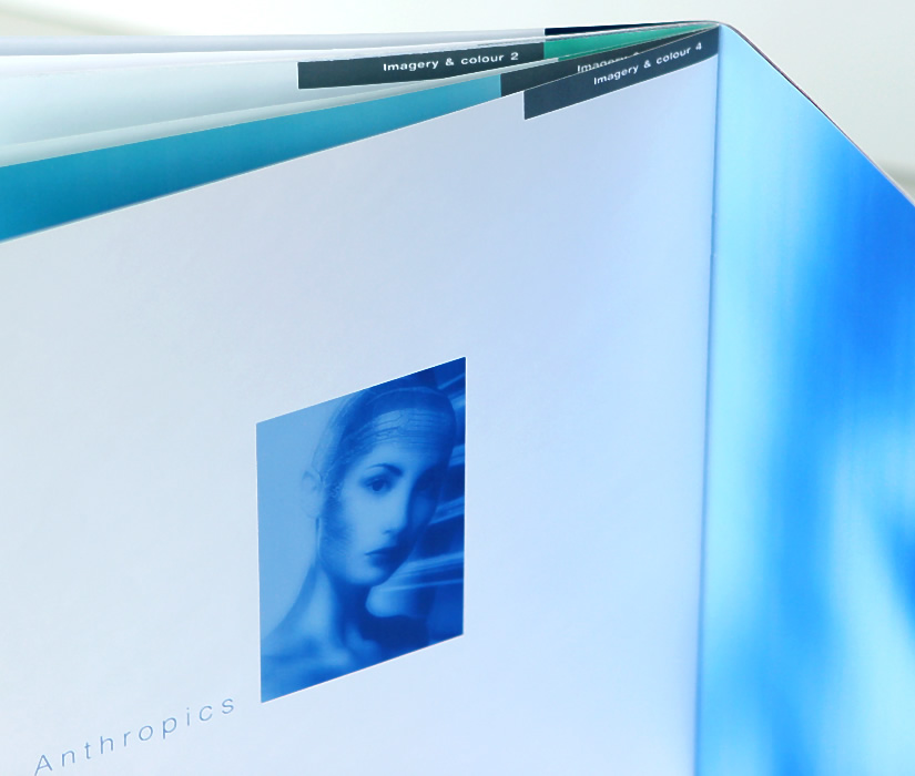
technology
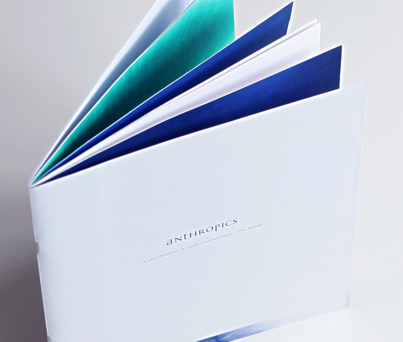
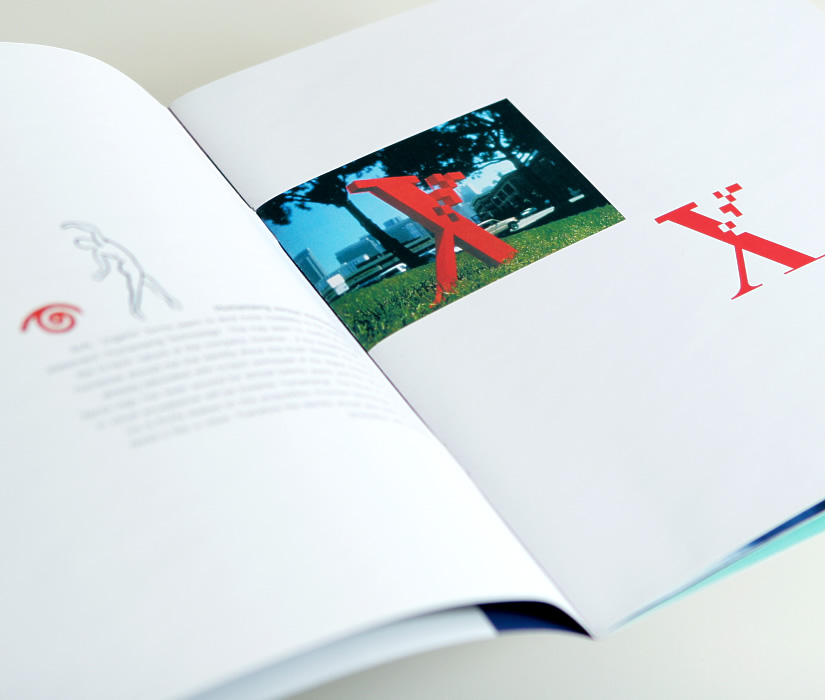
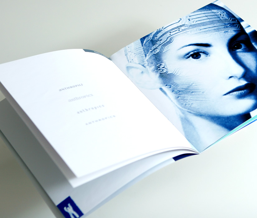
Anthropics
corporate identity: brand design
technology
Anthropics
corporate identity: brand design
technology
Anthropics
corporate identity: brand design

technology
Anthropics
corporate identity: brand design
technology
Anthropics
corporate identity: brand design

technology
Securitytec
corporate branding: logo and
colour space design
colour space design
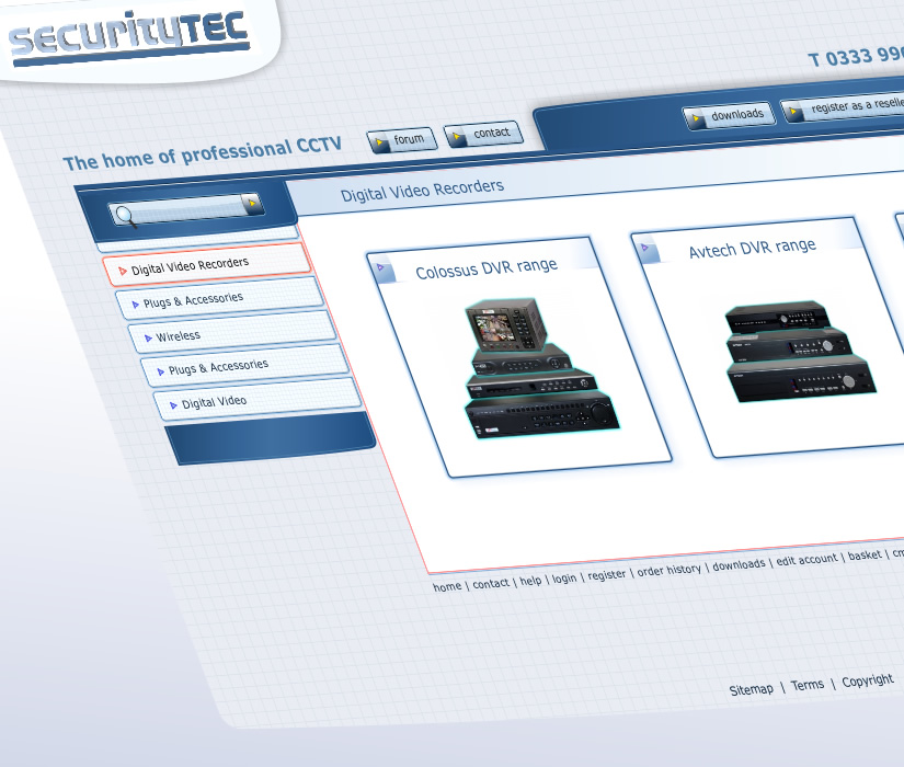
technology
Securitytec
website design
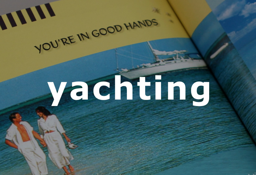
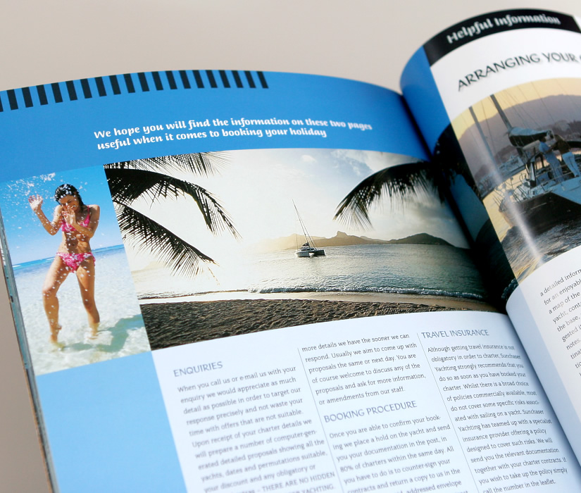
yachting
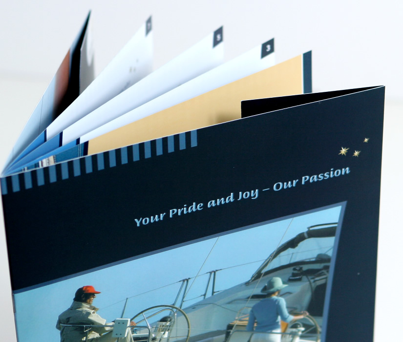
Sunchaser Yachting
product brochure, yacht charter
yachting
Sunchaser Yachting
product brochure, yacht charter
yachting
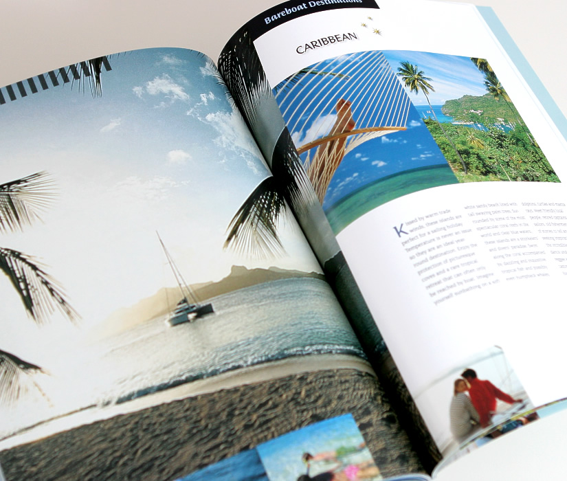
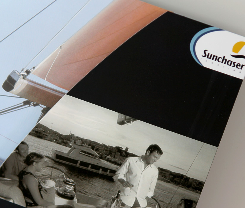
Sunchaser Yachting
product brochure, yacht charter
yachting
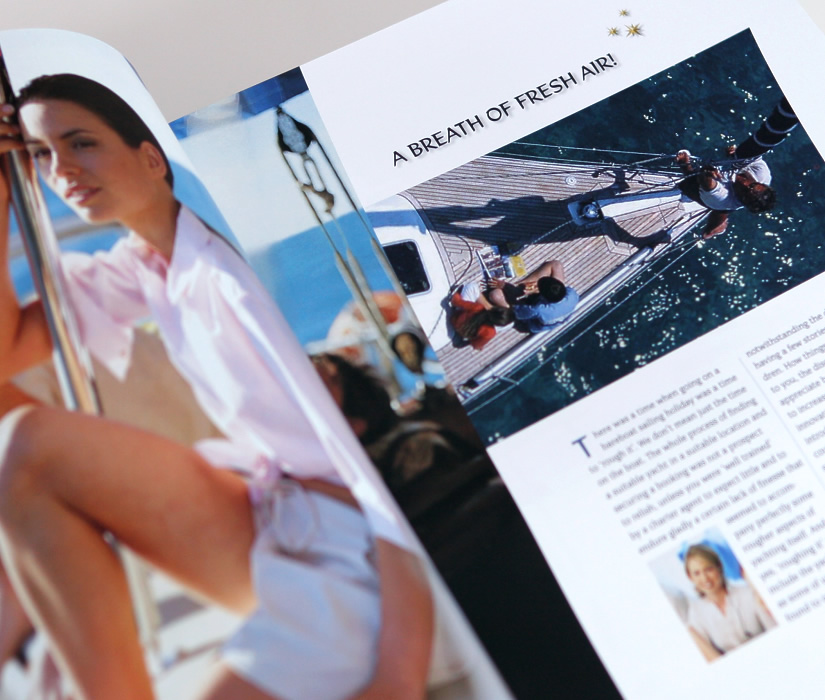
Sunchaser Yachting
product brochure, yacht charter
yachting
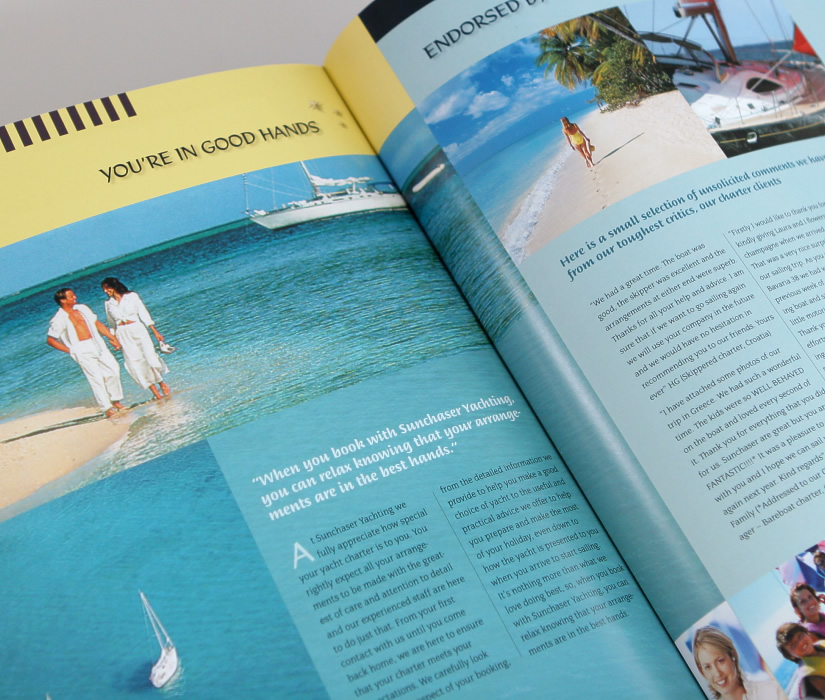
Sunchaser Yachting
product brochure, yacht charter
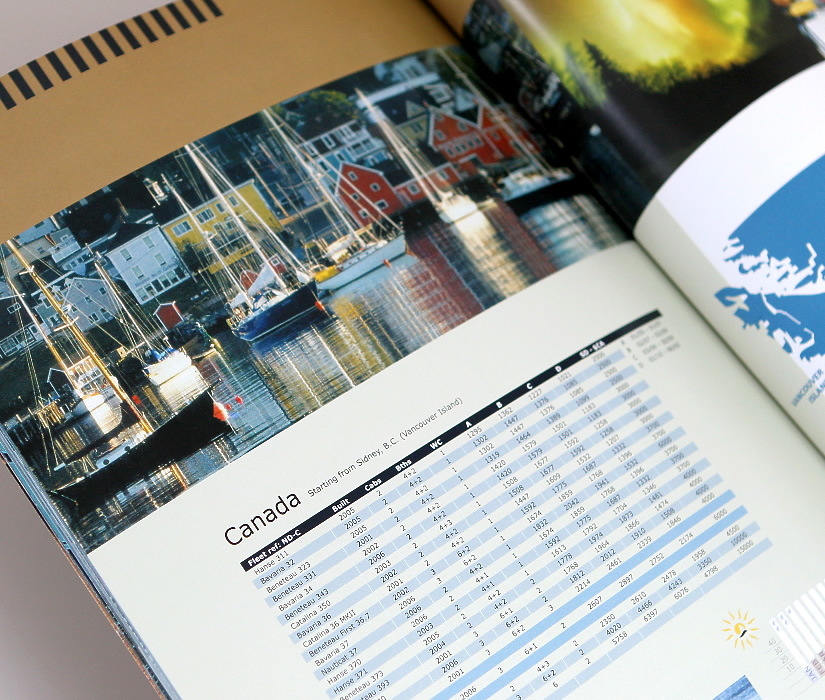
yachting
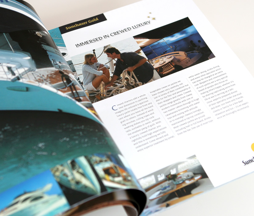
Sunchaser Yachting
product brochure, yacht charter
yachting
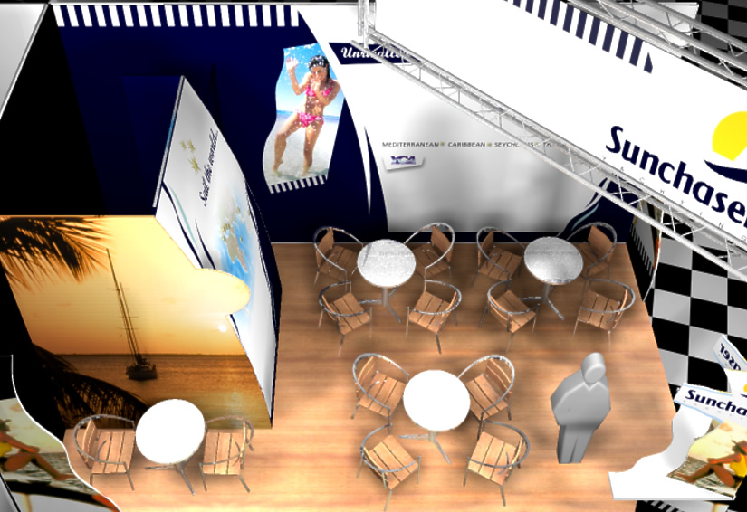
Sunchaser Yachting
exhibition stand: London Boat Show
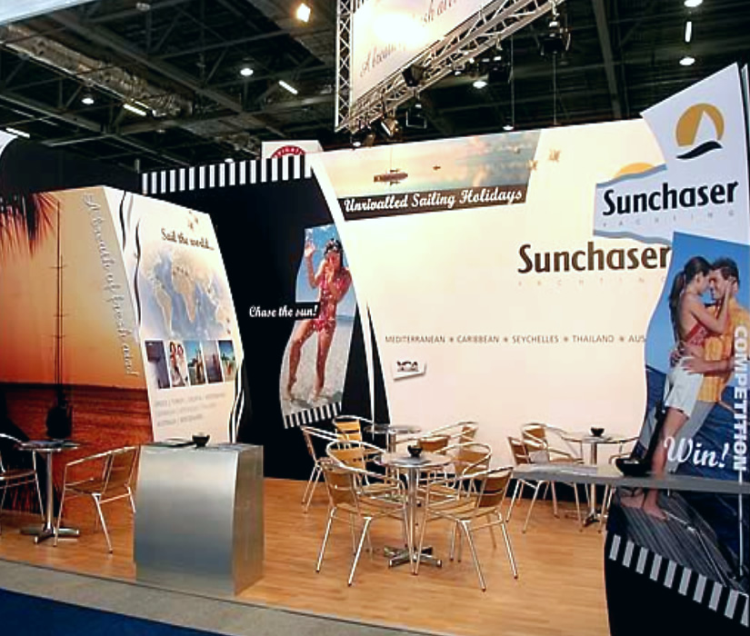
yachting
Sunchaser Yachting
exhibition stand: London Boat Show
yachting
Sunchaser Yachting
exhibition stand: London Boat Show
yachting
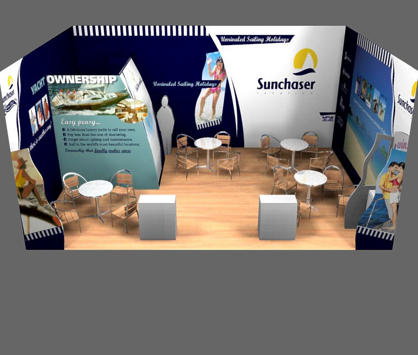
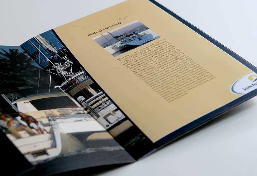
Sunchaser Yachting
product brochure, yacht partnership
yachting
Sunchaser Yachting
product brochure, yacht partnership
yachting
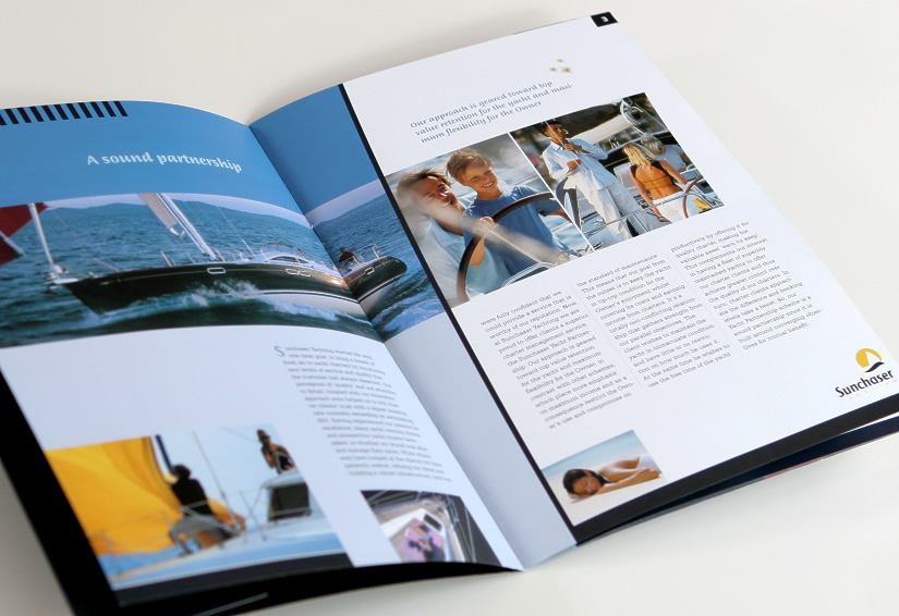
Sunchaser Yachting
product brochure, yacht partnership
yachting
Sunchaser Yachting
product brochure, yacht partnership
yachting
Boat Trader
exhibition stand: London Boat Show

yachting
Boat Trader
exhibition stand: London Boat Show

yachting
Boat Trader
exhibition stand: London Boat Show
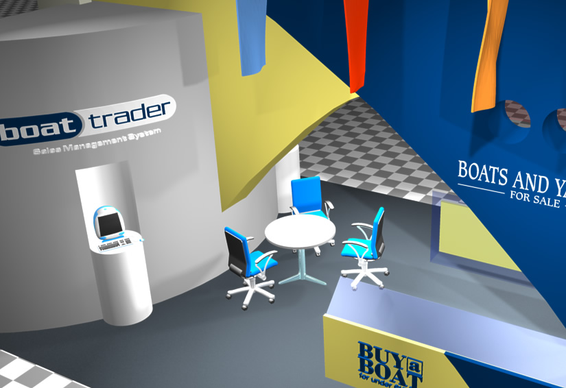
yachting
Boat Trader
exhibition stand: London Boat Show
yachting
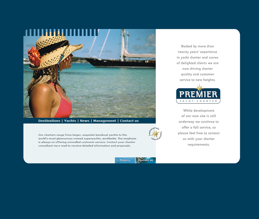
Premier Yachts
website design